

Your first refill starts with a clear plan See what to bring, how quantities work, and what's on the refill shelves. The main action is “Plan a first visit”. Supporting sections cover The weighing routine, Bring or borrow, Current essentials.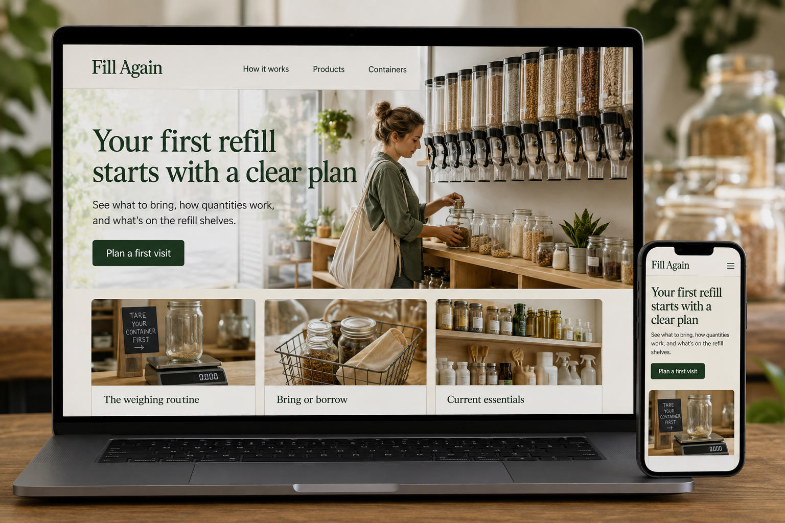
Explore this layout
A refill shop can feel unfamiliar to someone who has only bought packaged goods. They may wonder what container to bring, how weighing works, or whether a small amount is welcome. The website should answer those questions in a friendly sequence. Explaining the routine clearly helps a new customer picture a manageable visit instead of worrying about doing something incorrectly.
Walk through the first visit
Describe the store's actual sequence for checking containers, recording their empty weight, filling, and paying. Explain which steps staff handle and where customers can ask for help. Use simple illustrations or photographs of the relevant stations. If some products are dispensed only by staff, say so. Avoid assuming that a familiar term such as tare explains itself; a short plain-language definition can remove a surprisingly large obstacle to trying the shop.
Make product units understandable
Show how products are priced and give a clearly labeled example quantity when that helps shoppers compare. Keep food and household products in sensible categories with accurate ingredient and product information. State what is available for preorder versus in-store dispensing. If stock changes frequently, explain how visitors can check a particular item before traveling. Do not make environmental or product-performance claims that the shop cannot substantiate with appropriate information.
Explain the container options
Tell customers whether they can bring their own container, borrow or buy one, or use another packaging option the store offers. Describe the store's container acceptance process without turning the page into a scolding list. For delivery or click-and-collect, explain any deposit, return, and cleaning arrangement in the order flow. Customers should understand what they are paying for and how an empty container comes back into the system on a future visit.
Help people build a workable habit
Create a short checklist for a first refill trip and link it to opening hours, parking or access information, and the current product list. Feature realistic small-start ideas rather than implying that every household must change all its shopping at once. Measure first-visit page use, product availability inquiries, and repeat orders where relevant. Staff feedback can reveal which part of the process still needs a better sign, photograph, or sentence online.
Before you launch
- Explain tare in everyday language
- Label all pricing units
- Publish container options
- Separate preorder stock from refill availability
Does the website need a full online store?
Not necessarily. An accurate product list and a clear first-visit guide may serve the shop better initially. Add ordering when quantities, container charges, stock, and collection can be represented reliably. The online process should explain the same practical details customers would discuss at the counter.