

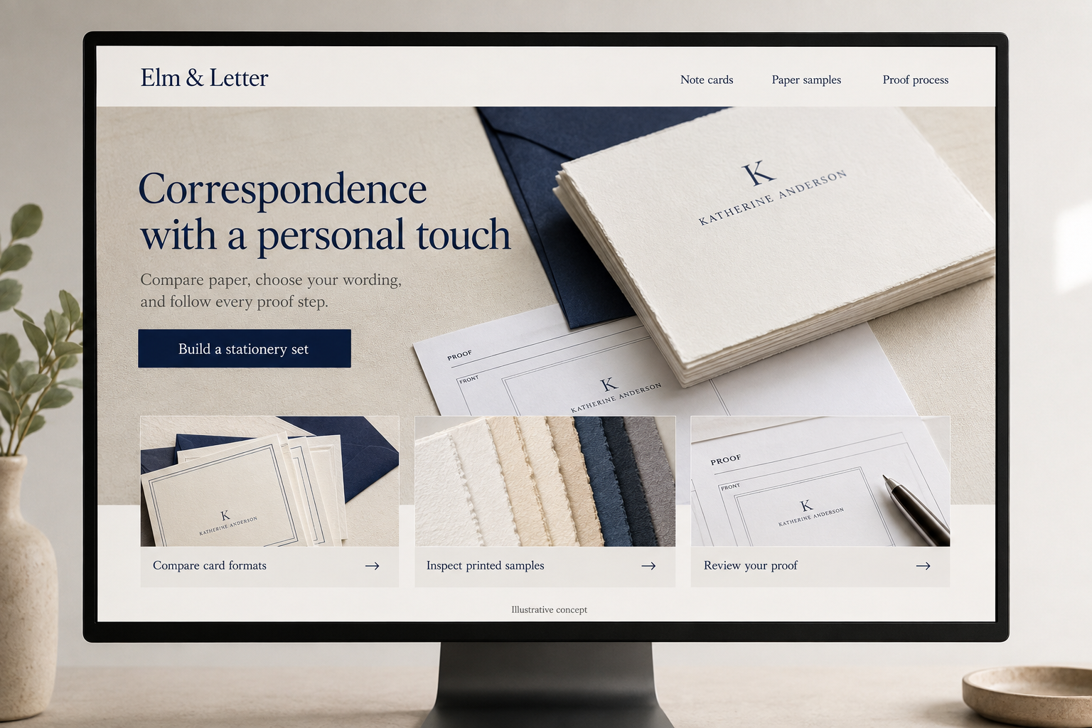
Explore this layout
Correspondence with a personal touch
Compare paper, choose your wording, and follow every proof step.
The main action is “Build a stationery set”. Supporting sections cover Compare card formats, Inspect printed samples, Review your proof.

A personalized correspondence set is a small purchase with details people care about deeply. A hypothetical Connecticut stationer needs to make paper, type, wording, and approval feel understandable on screen. The design should give customers room to inspect their choices while making it obvious which steps are a preview, which are a request, and which start production.
Let the occasion narrow the choices
Organize entrances around everyday correspondence, a housewarming gift, or a personal desk refresh, then let shoppers compare formats. State the card dimensions, number of sheets or cards, envelope quantity, and printing method in plain language. Do not make a shopper decode collection names to determine whether a set folds or lies flat. A photograph showing the stationery beside an envelope and pen can establish proportion without turning the page into a crowded lifestyle collage.
Treat the proof as part of the product
Collect the exact name or wording in clearly labeled fields and preserve punctuation. Explain whether the screen preview is illustrative or an actual production proof. Show the order of events: request received, proof prepared, customer approval, then production. State how revisions are handled and where a customer can review the latest version. A prominent approval status is more useful than a general promise of personal service when a gift date is approaching.
Give paper its own evidence
Close photographs can show surface texture, edge, and thickness, but color and feel are difficult to judge through a screen. Offer a sample pack if the studio can fulfill one, and explain how its papers correspond to the available sets. Keep finish names consistent between samples and products. For customers choosing a darker ink or a fine typeface, show realistic printed examples at a useful scale rather than only enlarged digital artwork.
Make a second order pleasantly short
Allow a returning customer to find a previous design, confirm the wording, and check whether paper or production choices have changed. Do not assume that an old delivery address or gift message should carry forward. Educational pages comparing note cards and letter sheets can bring new readers into these clear product paths. Measure completed proof approvals and repeat orders alongside sales so delays in the personalization process remain visible.
Before you launch
- Distinguish digital previews from final proofs.
- Repeat exact personalization in the review screen.
- Map sample papers to matching product options.
- Require address confirmation on a reorder.
Should personalization go straight into production after payment?
That depends on the studio’s stated process. If a proof is promised, payment should not be presented as final artwork approval. Show the approval milestone and tell the buyer what happens if they request a correction. For fixed designs without proofs, explain that boundary before they submit the wording.