

Explore this layout
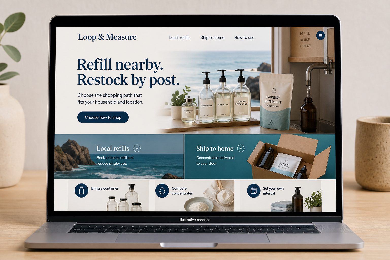
Refill nearby. Restock by post.
Choose the shopping path that fits your household and location.
The main action is “Choose how to shop”. Supporting sections cover Bring a container, Compare concentrates, Set your own interval.

A refill counter and a mail-order concentrate shop can share a brand without sharing every checkout step. In a hypothetical California household-goods business, local customers bring containers while distant customers need products suitable for shipping. The website should identify those two journeys immediately, then keep product instructions, quantity choices, and order expectations consistent within each one.
Offer two unmistakable entrances
Use “Visit for a refill” and “Shop shipped products” as clear choices near the top of the site. The local path needs the shop’s real location, opening information, accepted container process, and any appointment requirement. The shipped path needs available formats and destination information. Do not place a counter-only refill in a nationwide product grid without a visible restriction. Someone should know whether an item can reach them before investing time in choosing it.
Write directions around the actual container
For a concentrate, explain the amount supplied, the intended dilution process using the product’s own directions, and which container is required. A simple illustration can show the package contents beside the separately needed bottle. Avoid unsupported environmental comparisons or broad claims about every household use. Keep ingredient and manufacturer information accessible. Buyers comparing two formats need the final usable quantity and the refill quantity expressed in units they can readily compare.
Make repeat orders a considered choice
Offer one-time purchase alongside any subscription rather than assuming every buyer knows their usage rate. Show the interval, upcoming charge timing, and how to change the quantity or skip an order. If a local returnable-container program exists, explain it on its own terms instead of applying it to shipped orders by implication. A brief usage note can help shoppers select an initial amount without pushing them toward the largest package.
Connect helpful demonstrations to the right path
A guide showing how a specific refill product is prepared should link to that product and its required accessories. A page about visiting the counter should lead to local instructions. This keeps discovery traffic from landing in the wrong fulfillment route. Review abandoned carts separately for shipped products and local selections. Confusion about eligible destinations, container requirements, or subscription timing calls for a content correction before a promotional discount.
Before you launch
- Label counter-only refills in search results.
- Show the container required for each concentrate.
- Keep one-time purchase easy to select.
- Test subscription changes from a customer account.
Can local refills and shipped concentrates share a product page?
They can if the formats and fulfillment rules are unmistakable, but separate pages are often easier when prices, containers, and ordering steps differ substantially. Link the two formats so a customer can switch deliberately. Do not let a shipping address silently convert a counter refill into a different product.