

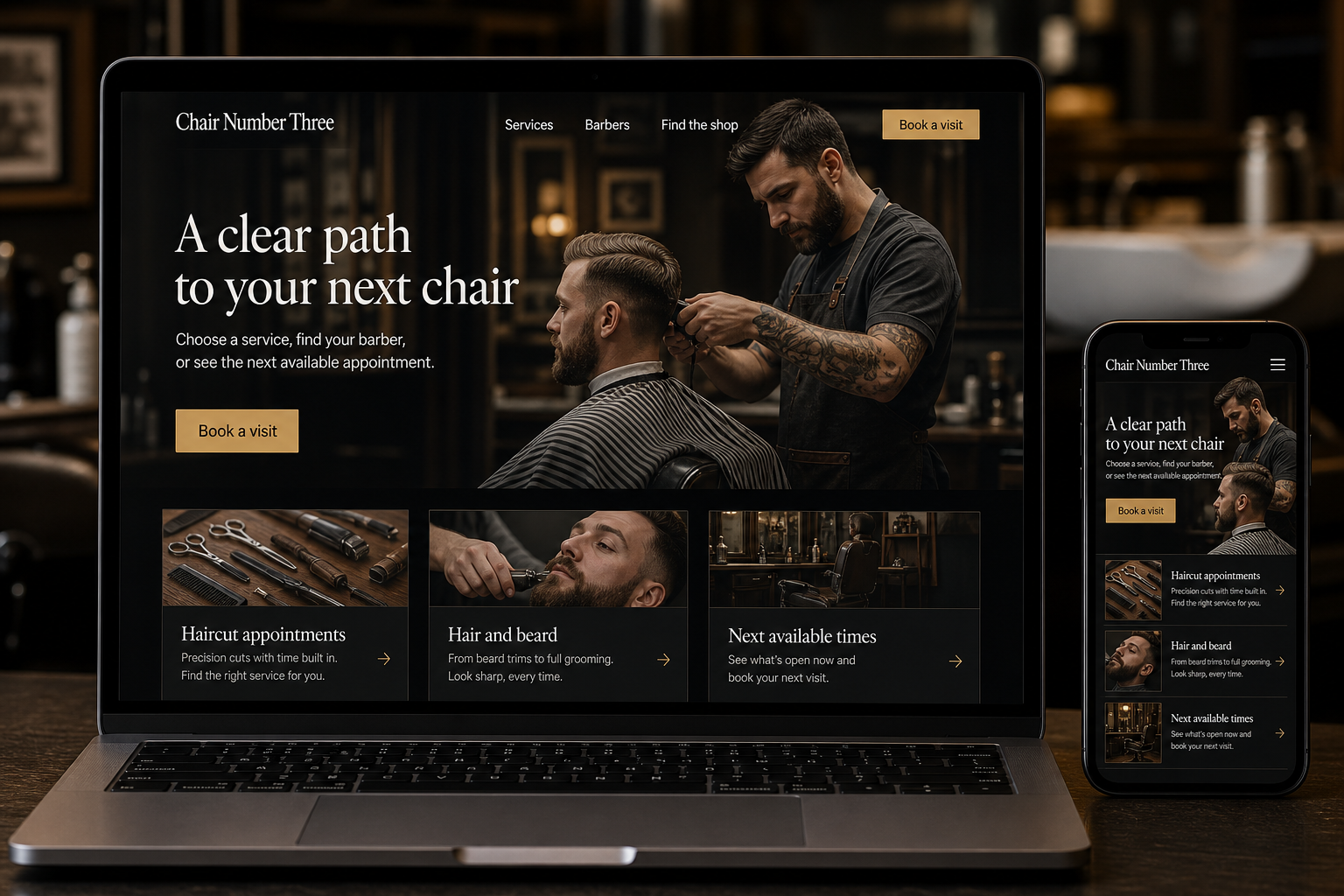
Explore this layout
A clear path to your next chair
Choose a service, find your barber, or see the next available appointment.
The main action is “Book a visit”. Supporting sections cover Haircut appointments, Hair and beard, Next available times.
A barbershop website often succeeds by removing small uncertainties quickly. Customers want to choose a service, find a barber or available time, and know how the shop handles arrival. Regulars should be able to repeat a familiar booking, while first-time visitors need enough explanation to avoid selecting the wrong appointment. The design can show personality without slowing that practical path.
Name services in everyday language
Describe the haircut, beard, and combined appointments the shop actually provides, with duration and pricing presented clearly. Explain which options are appropriate for a more substantial change or a longer consultation. Avoid making clients decode internal scheduling labels. If a service excludes an element someone might reasonably expect, clarify that beside the option. A concise menu with meaningful differences is easier to choose from than several overlapping packages described only as increasingly premium experiences.
Show availability without creating a maze
Let visitors book with a preferred barber or view the next suitable opening across the team. Preserve the selected service as they compare times. Make clear whether the appointment is confirmed immediately and how changes are handled. For walk-ins, explain the actual queue arrangement and avoid presenting an estimated wait as a guarantee. Customers should understand the difference between joining a list, requesting a time, and holding a confirmed appointment before they leave the page.
Make first-time arrival uncomplicated
Keep the location, entrance details, opening hours, and any relevant access information easy to find from the booking page. Show real photographs of the shop and team where permission is available. A short note about when to arrive can be useful if it reflects actual practice. Avoid filling the page with an invented neighborhood history or unsupported claims about being the area's favorite. Specific, current information does more to make a new visitor comfortable.
Support the next visit without extra effort
Provide a simple route from confirmation or account history to booking the same type of appointment again. If the shop offers reminders, explain the communication choice clearly and use it for the expected purpose. Measure completed bookings, repeat visits where records support it, and avoidable service changes. Ask staff whether clients are reserving enough time for the work they want. That feedback can guide a better menu more reliably than redesigning the page around clicks alone.
Before you launch
- Show duration beside each service
- Separate walk-in queues from bookings
- Offer any-barber availability
- Keep rebooking tied to the right service
Should every customer have to choose a barber?
No. Some customers have a preference, while others care most about finding a suitable time. Offer both routes where scheduling supports them. Explain who will perform the appointment once confirmed so a convenient booking option does not leave the customer uncertain about the arrangement.