

Choose fabric for the way it will move Explore drape, texture, and practical specifications before planning your next cut. The main action is “Browse fabrics”. Supporting sections cover See print scale, Understand cut units, Request a sample.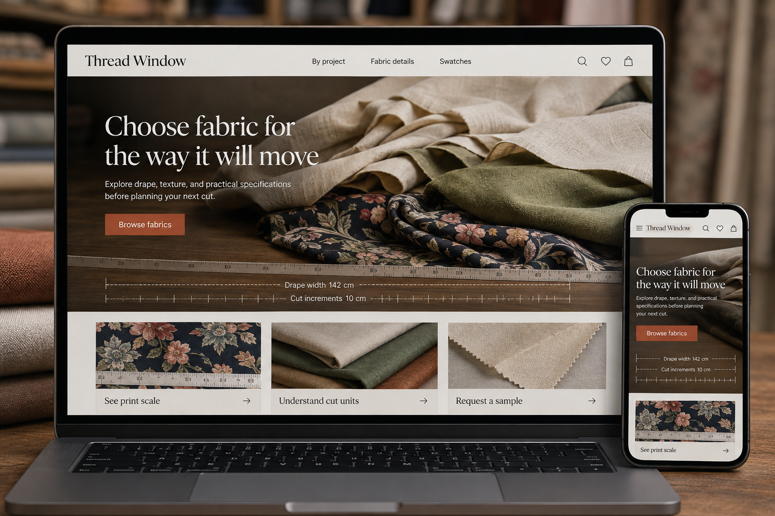
Explore this layout

Fabric shoppers are trying to imagine movement and feel through a screen. A printed pattern or appealing color gets their attention, but it rarely tells them whether the fabric suits a shirt, curtain, or structured bag. The website should explain those practical characteristics and make the ordering unit unmistakable before someone calculates how much material they need.
Describe fabric in project terms
Organize browsing by fiber, construction, and useful project characteristics without claiming that one fabric suits everything. Explain drape, opacity, texture, and stretch where these have been assessed. A short movement video can reveal more than a flat swatch, provided it has a written description too. Show a scale reference for prints. Customers need to distinguish a tiny repeat from a large motif before deciding whether it works with their pattern pieces.
Make quantity arithmetic clear
State the usable width, selling increment, and whether multiple units arrive as one continuous cut. Update the total length beside the basket control so customers can check their selection. Describe minimum cuts and any limits for remnants separately. A half-unit price should not appear to be the price of a full meter or yard. Keep the measurement system consistent, or provide both units with labels that remain visible on narrow screens.
Give swatches a sensible role
Offer swatches where feasible and explain their size, charge, and relationship to current stock. A sample should not imply that the main fabric is reserved while a customer considers it. Show manufacturer care information when available and make uncertainties clear. If dye lots or natural variation may affect matching, describe the ordering implication plainly. These details support considered buying, especially when color coordination matters more than the speed of the initial purchase.
Let project content support the catalog
Create guides around questions such as interpreting fabric weight or choosing an opaque lining. Keep the explanation practical and connect it to suitable categories rather than promising a particular finished result. Measure swatch requests, full-length purchases, and quantity-related support questions. When a guide produces confusion about units, fix the purchase interface as well as the prose. Good editorial content should reinforce an ordering process that already makes physical quantities easy to understand.
Before you launch
- Show total selected fabric length
- State continuous-cut behavior
- Photograph print scale
- Explain whether swatches reserve stock
Should remnants use the same product page as cut fabric?
A separate remnant listing is usually clearer because its dimensions and quantity are fixed. Show the actual piece size, any irregularities, and whether it is sold as a single item. Customers should not mistake a remnant price for the regular price per unit of fabric.